How to Stop Losing Volunteers After One Event
Most volunteers leave after their first shift. Learn why it happens and how to turn one-time helpers into long-term supporters with better experiences.
‹ Previous Post
Increasingly, individuals are discovering nonprofit causes they’d like to support online. This means your organization’s website is likely the first place a prospective volunteer interacts with your mission. If your website’s user experience is confusing or inaccessible, you may be losing potential dedicated supporters before they engage meaningfully with your nonprofit.
In this guide, we’ll explore strategic, technical, and design-focused updates you can make to optimize your nonprofit website for volunteer conversion. Use these tips to transform your website into a conversion engine that guides people seamlessly from “curious visitor” to “registered volunteer.”
An accessible website is fundamental to your conversion strategy. If your website is not navigable for individuals of differing abilities or circumstances, you will potentially exclude a significant portion of your audience, many of whom are eager to volunteer.
To maximize your reach, ensure your website adheres to the Web Content Accessibility Guidelines (WCAG). Here are a few areas to focus on as you get started:
Additionally, certain types of organizations must specifically adhere to web accessibility guidelines to ensure their websites are usable by people with disabilities. For instance, Section 508 of the Rehabilitation Act requires access to electronic and information technology provided by the Federal government.
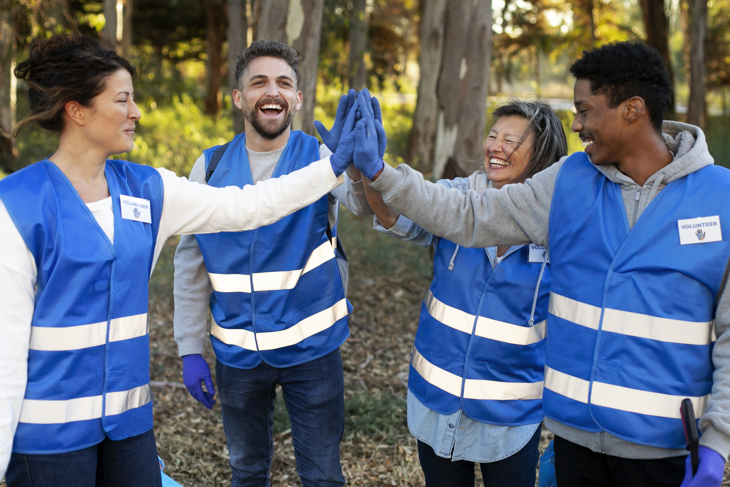
By removing accessibility barriers, you signal to prospective volunteers that your organization values inclusivity at an institutional level, fostering trust before the application process even begins. This is also a good moment to check your third-party volunteer software to confirm that your tools meet user accessibility standards—the best platforms (like Golden) make this a top priority!
One of the most significant drop-off points in the volunteer journey is the application form itself. Complex, lengthy, or technically unstable forms create friction that deters potential supporters. Treat your volunteer application with the same care as your donation checkout process by implementing:
Additionally, only request the necessary volunteer information, as lengthy forms can result in higher abandonment rates. For instance, if you require volunteers to provide both a mobile phone number and a home phone number, many potential volunteers might leave the form incomplete due to irritation or because they only have one phone number. Instead, have them provide a single phone number and offer them the option to list additional numbers.
Not all volunteers are a good fit for every volunteer opportunity. For instance, a busy corporate professional may not be able to attend opportunities during the work week. If they’re directed to a page that mostly lists activities they can’t participate in, chances are that they won’t sign up to be a volunteer.
Rather than directing all traffic to a generic “Volunteer” page, create dedicated landing pages for specific roles or segments. This redirects interested individuals or businesses to the right place to see opportunities that best fit their needs. The types of segments you might feature include:
Customize the copy on each page to address each audience’s specific motivations and needs. For example, your student volunteer page might highlight skill-building and credit hours, while a page for retirees might focus on community building and mentorship. You can also use this space to present the requirements relevant to specific roles for those segments.
Additionally, incorporate live impact metrics, recent success stories, and visual storytelling that demonstrate the impact volunteers have on your community. Often, volunteers want proof that their time will genuinely help you further your mission. Proof of impact does just that, allowing your nonprofit to bridge the gap between interest and application.
After you’ve made it easy for volunteers to register by providing them with the information they need, guide visitors to your optimized sign-up form with strategically placed, visually distinct, and action-oriented calls to action (CTAs).
Here are a few tips for CTA positioning:
If you’re not confident in your CTA strategy, take a look at other nonprofit websites to see how they handle CTAs. Seeing real-life examples can give you an idea of how to get started or help you identify where to tweak your CTAs to maximize volunteer signups.
Remember that your website is a reflection of your nonprofit. A seamless, professional volunteer conversion experience suggests a well-run volunteer program. This gives prospective supporters the confidence to invest their time and talent in your mission, ultimately leading to increased support for your nonprofit.

Most volunteers leave after their first shift. Learn why it happens and how to turn one-time helpers into long-term supporters with better experiences.
‹ Previous Post
Discover why thanking volunteers matters and how authentic appreciation strengthens relationships, engagement, and long-term commitment.
Next Post ›1:1 consultation aimed at transforming your volunteer program
Learn how to transform supporters into donors
Help us spread our message